Retro style usually starts with one object you did not plan to buy. A lamp with a smoky glass shade. A sideboard with a stubborn drawer. A mustard chair that looks slightly ridiculous until you put it in the right corner. Then, somehow, the room has a pulse.
That is the appeal of retro decorating. It is not about recreating a 1970s living room exactly, with the ashtray, the shag carpet and the wallpaper all doing too much at once. It is about borrowing the good parts: warm wood, odd curves, brave colour, a bit of humour. Sometimes even a little bad taste, but in the best possible way.
The word “retro” gets stretched in every direction. One person sees a 1950s diner stool. Another thinks of a 1960s record cabinet or a brown-and-orange conversation pit from the 1970s. They are not all wrong. Retro is less a strict period than a mood: recent-past design brought back into the present with a wink, not a history lesson.
What is retro style, really?
Retro style is design that looks backwards without actually living there. It borrows shapes, colours and materials from earlier decades — especially the 1950s, 1960s and 1970s — and uses them in today’s homes. A new orange velvet sofa can be retro. So can a reproduction globe lamp, a checkerboard floor, or a kitchen stool that looks as if it came from a roadside diner outside Palm Springs.
This is where people often mix up retro and vintage. Vintage means the object itself is old enough to belong to an earlier period. Retro means the look is inspired by the past. A 1970s ceramic lamp found at a flea market is vintage. A new ceramic lamp copying that shape is retro. In most homes, of course, nobody is standing there with a clipboard checking the difference. The two usually mix quite happily.
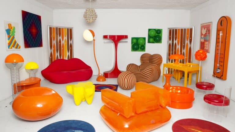
A few things signal the retro look quickly. Avocado green and mustard yellow on the walls. Burnt orange velvet on a low sofa. Teak or walnut furniture standing on skinny legs. Smoked glass on a sideboard. Sunburst clocks, mushroom lamps, record players, chunky mugs. You know it when you see it. Sometimes you know it because your parents once owned it and swore they never would again.
Why retro rooms still feel good
There is a reason this look keeps coming back. A lot of contemporary interiors are calm, pale and tasteful. Very tasteful. Maybe too tasteful. Retro style brings in something less polite: colour, shape, memory, a little oddness. It gives a room something to say.
It also has warmth. The woods are usually honeyed or dark. The fabrics have texture. Even the shiny things — chrome lamps, glass tables — tend to sit beside something softer. A shag rug under a clean-lined coffee table. A velvet chair next to a metal floor lamp. Ribbed glass catching afternoon light on a sideboard. Small things, but they change the feeling of a room.
And then there is nostalgia, which is rarely tidy. A retro interior might remind you of an old hotel lobby, a family photo album, a thrift store in summer, a record sleeve, a grandmother’s kitchen, or a café that smelled faintly of coffee and furniture polish. Not every memory is glamorous. That helps. Retro style works best when it has some life in it.
Start with one piece, not a whole theme
The fastest way to ruin a retro room is to buy the whole idea at once. Orange sofa, lava lamp, vinyl records on the wall, checkerboard floor, plastic side table, shag rug. Suddenly the room is not decorated; it is performing.
Start smaller. Find one piece that makes the room feel different. Maybe a low wooden sideboard. Maybe a tulip table. Maybe a pair of chrome stools with red seats, slightly scratched but still charming. Let that piece lead, then add around it slowly.
Good retro decorating usually leaves air around the best pieces. A sideboard looks stronger against a plain wall. A wild rug behaves better under simple furniture. A statement lamp needs darkness in the evening, not six other statement lamps shouting beside it. Obvious? Yes. But flea market enthusiasm is not known for its restraint.
Colour is where the fun starts
Retro colour has personality before you even put it on a wall. Mustard and olive sit together without arguing. Rust and tobacco brown feel like a room that has already hosted a few good evenings. Petrol blue next to cream makes the cream look warmer than it actually is. These are not shy colours, but they do not have to shout either.
If you are nervous, do not start with wallpaper. Start with one colour in one object. A mustard armchair in a neutral living room. A burnt-orange lamp on a walnut cabinet. A green glass vase on a simple shelf. That is often enough to shift the atmosphere.
If you want more drama, pair two colours from the same family of decades: olive and rust, brown and cream, orange and smoked glass, mustard and dark wood. The trick, if there is one, is to let something stay quiet. A white wall, a plain curtain, a simple rug. Without that, even good colours start elbowing each other.
Furniture with curves, legs and attitude
Retro furniture rarely looks anonymous. A 1960s-style sideboard stands on skinny legs and seems to hover slightly above the floor. A 1970s lounge chair sits low and wide, as if it has no intention of getting up. A kidney-shaped coffee table refuses to be sensible. That is the charm.
In a living room, one strong shape can do most of the work. A curved sofa. A low armchair. A wooden cabinet with sliding doors. Do not feel obliged to create a matching set. Actually, matching too much is one of the things that makes retro rooms feel stiff. A little mismatch looks more believable.
When buying older furniture, check the unromantic parts. Drawers should open. Legs should not wobble like a nervous deer. Veneer can be repaired if the damage is small, but swollen corners are usually bad news. Scratches are fine. Sometimes lovely. Structural drama is less lovely.
Pattern, but not everywhere
Retro loves pattern. Big flowers, checks, stripes, abstract shapes, paisley — pattern gives the room movement, but it also gets bossy fast.
A rug is a good place to try it. So are cushions, curtains, a single upholstered chair, or framed fabric if you find a good piece at a market. Wallpaper is more committed. It can be wonderful in a hallway or small dining area, especially if the rest of the space stays simple. A full room of giant orange flowers? It might work. It might also make breakfast feel like an event.
One easy rule: if the pattern is loud, let the furniture speak more softly. If the furniture is already sculptural and colourful, choose a quieter pattern. Retro style can handle a lot, but it still needs someone in the room to be the adult.
Texture makes retro style feel less like a costume
The best retro rooms are tactile. Smooth plastic next to ribbed glass. Velvet against chrome. Cane beside wool. Lacquer beside wood. You do not just look at the room; you want to touch things. That is why a flat, all-new retro scheme can feel disappointing — it has the colours, but not the weight.
Try mixing a few surfaces that do not behave the same way. A glass lamp on a wooden sideboard. A wool rug under a lacquered table. A velvet cushion on a cane chair. These combinations stop the room from looking like a catalogue spread.
Shag rugs are the obvious retro texture, and yes, they can be wonderful. But choose the room carefully. A shag rug in a reading corner feels cosy. Wall-to-wall shag near food, pets or small children is a lifestyle choice. Possibly a brave one.
Lighting does more than you think
A room can have all the right furniture and still feel flat if the lighting is wrong. Retro lighting is helpful because it has shape. Globe lamps, mushroom lamps, opaline glass pendants, chrome arc lamps, cone shades, sputnik chandeliers — they work as objects even before you switch them on.
A small lamp on a sideboard can change a whole corner. Add a ceramic bowl, a few books, maybe a framed print above it, and suddenly the space looks considered without trying too hard. That is often the sweet spot.
One practical note, because old lamps are not always innocent: check the wiring. If the cord looks brittle, frayed or suspiciously ancient, have it rewired. A beautiful lamp should glow. It should not crackle.
Small retro details that actually work
Accessories are where you can have fun without repainting a room. A vintage wall clock, a ceramic ashtray used for keys, a stack of old records, a framed travel poster, a coloured glass vase, a bar cart, a rotary phone that no longer does anything useful. These pieces bring the mood in small doses.
The danger, again, is quantity. Flea markets make this difficult because small things are easy to justify. “It was only ten dollars” is how shelves become crowded. Try grouping objects instead: three pieces on a sideboard, one strong poster, one lamp, one plant. Leave some empty space. Empty space makes the good finds look better.
Also, mix in something current. A contemporary print, a simple vase, a plain linen curtain. Retro looks fresher when it is not trapped entirely inside one decade.
Where retro style works best at home
You do not need to push the same retro mood through every room. It can be stronger in one area and quieter elsewhere. That usually feels more natural, especially in a real home where laundry, laptops and phone chargers also exist.
In the living room, start with the anchor pieces: sofa, rug, armchair, sideboard, lamp. A low cabinet with a record player on top still works, even if most of the music now comes from a phone. In the kitchen, retro can be as simple as chrome stools, a Formica-style table, coloured enamelware or a checkerboard floor. In a bedroom, softer tends to work better — warm wood, globe lamps, a patterned bedspread, maybe a 1970s mirror. Bathrooms can take a little drama too: terrazzo, ribbed glass, coloured tiles, rounded mirrors. Just maybe think twice before committing to permanent avocado fixtures.
Shopping for retro decor at flea markets
Flea markets are perfect for this style because retro pieces often look a bit unloved before they look good. A dusty lamp under a table. A chair with terrible fabric but beautiful legs. A mirror leaning behind a stack of frames. You have to slow down and look twice.
For furniture, check the frame before you fall in love. Open drawers, look at joints, run a hand over the veneer, and smell the upholstery. Smell matters. A chair that has spent twenty years in a damp garage may keep that history longer than you want it to.
For smaller objects, look for weight and finish. Good ceramics feel different in the hand — denser, cooler, more deliberate. Glass should have a pleasing heaviness. Old plastic can be fantastic, but check for cracks and yellowing before you commit. Not everything from the past deserves a rescue mission.
Bring measurements. This is boring advice and therefore easy to ignore. But retro sideboards can be enormous, and a sofa that looks sleek in a market hall may look like a parked boat in your apartment. Tape measure first, romance second.
If you are new to it, begin with lamps, clocks, mirrors, ceramics, trays, cushions, small tables or framed prints. They are easier to move, easier to resell, and less likely to cause a domestic crisis. For more practical buying advice, our vintage shopping tips are a useful next stop.
Retro vs vintage: the simple version
Retro is a style. Vintage is an age. That is the short version.
A new fridge designed to look like it belongs in the 1950s is retro. A real 1950s fridge is vintage, although you may not want to pay the electricity bill. A new sofa in rust velvet with rounded arms is retro. A sofa actually made in the 1970s is vintage. The words overlap in conversation, and that is fine. But if you are buying, the difference matters.
Retro gives you freedom to choose the look without being tied to the object. Vintage gives you the object itself, with all its age and imperfection. A room with both usually feels richer than one trying too hard to be either.
Common mistakes with retro decorating
The first mistake is turning the room into a theme. A little diner energy in a kitchen can be charming. A full diner fantasy in a small apartment can feel like a movie prop department got loose.
The second mistake is assuming old-looking means good. Some retro pieces are elegant. Some are funny. Some are just ugly. The past produced plenty of bad design, and it is under no obligation to improve with age.
The third mistake is forgetting comfort. Sit in the chair. Switch on the lamp. Walk across the rug barefoot. Imagine the room on a grey Tuesday evening, not just in bright market-day sunshine. If it still feels good then, you are probably onto something.
FAQ: retro style decorating
What does retro style mean in interior design?
Retro style means decorating with colours, shapes, furniture and materials inspired by past decades, especially the 1950s, 1960s and 1970s. The pieces can be old, new or a mix of both.
What colours are used in retro decor?
Common retro colours include mustard yellow, avocado green, burnt orange, rust, chocolate brown, cream, tomato red and petrol blue. Use one or two strong shades and balance them with wood tones, white or black — otherwise the palette takes over the room.
Is retro the same as vintage?
No. Retro describes a look inspired by the past. Vintage describes an object that was actually made in an earlier period. A new 1960s-style lamp is retro; an original 1960s lamp is vintage.
How do you make retro style look modern?
Keep the balance simple. Pair one or two retro pieces with cleaner modern elements — plain walls, neutral curtains, contemporary art, a simple sofa. The contrast makes the retro details feel intentional rather than dated.
Final thoughts on retro style
Retro style works best when it feels a little collected, a little imperfect and not too obedient. One good lamp can do more than ten themed accessories. One odd chair can make a quiet room memorable. A colour you were unsure about can end up being the whole point.
So start with the piece that makes you look twice. Let the room grow from there. Retro decorating should have humour, warmth and a bit of nerve. Not too much polish. Definitely not too much matching. Just enough past to make the present feel more interesting.